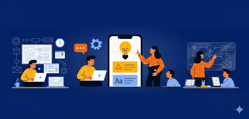
The best apps don’t come with instruction manuals.Think of how you use WhatsApp, Instagram, or Uber —no training is needed, because the design is sointuitive. For startups, creating “zero-training”interfaces is critical. It reduces onboarding time,improves user adoption, and makes customers morelikely to stick around. Simplicity is not just design —it’s strategy.

Analysis / Market Findings
- User Expectations: Studies show that 70% of users abandonan app if it’s too complicated during the first use.
- Simplicity Wins: Clear navigation, familiar gestures (like swipeor tap), and clean layouts reduce cognitive load and make appsuniversally accessible.
- Consistency is Key: Icons, button placement, and workflowsshould follow predictable patterns — users should neverwonder, “What happens if I click this?”
- Real-World Example: Apps like Slack and Zoom becamemainstream not only because of functionality but becauseanyone could use them immediately, regardless of technicalskills.
“An intuitive app feels natural — as if users already know how it works. Zero- training design turns first-time users into long-term loyal customers.”
Designing intuitive apps isn’t about limiting features — it’s about presentingthem smartly. Every screen, button, and interaction should serve a purpose andmake life easier for the user. For startups, this approach builds trust quickly andencourages rapid adoption. Remember: if your app needs a tutorial, it probablyneeds a redesign.